- January 6, 2024
- by Shahriar Kabir
How to Center Collection Grid Links on Images in the Shopify Dawn Theme
When customizing your Shopify store, small details can make a big difference in user experience. A common design element in the Dawn theme is the collection grid, but sometimes, the default placement of grid links might not align with your store’s aesthetic. In this post, we’ll walk through the steps to reposition these links from below the grid to the center of each image, creating a more streamlined and visually appealing layout.
The Challenge
In the standard Dawn theme, collection grid links are positioned under each grid item. This traditional layout, while functional, may not always capture the user’s attention effectively. For a more modern and engaging design, centering these links on the image itself can be a game changer.
If you prefer video tutorials over text, feel free to skip this post and watch the video below. If not, please continue reading.
The Solution
To achieve this, a few lines of CSS can work wonders. Here’s the code snippet that you’ll need:
ul.collection-list.grid {
    padding-bottom: 36px;
}
li.collection-list__item.grid__item .card {
    position: relative;
}
li.collection-list__item.grid__item .card:before {
    content: '';
    position: absolute;
    top: 0;
    left: 0;
    right: 0;
    bottom: 0;
    background-color: rgba(0, 0, 0, 0.5);
    z-index: 1;
}
li.collection-list__item.grid__item .card__content {
    position: absolute;
    text-align: center;
    top: 50%;
    left: 50%;
    transform: translate(-50%, -50%);
    z-index: 2;
    width: 100%;
}
li.collection-list__item.grid__item .card__content a {
    color: #fff;
    text-transform: uppercase;
}
li.collection-list__item.grid__item .card__content a .icon-wrap {
    display: none;
}
Step-by-Step Implementation
- Go to Online Store → Themes, and then click on 'Edit code' for your current theme.
- Find the base.css file where you can add the above custom CSS. You can find the base.css file under Assets folder.
- Copy and paste the above code snippet into the file. This code will add a semi-transparent black overlay to the collection cards and center the text inside it.
- Always save your changes and preview them to ensure everything looks as expected.
Before Collection Grid

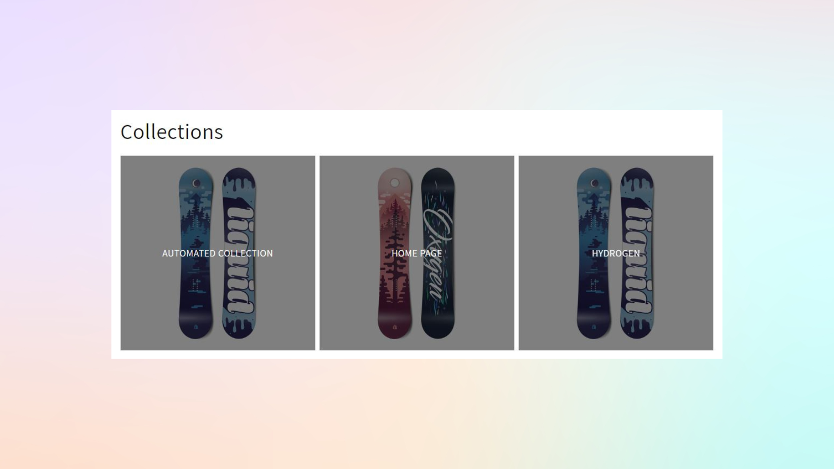
After Collection Grid

Notice how the links are now prominently displayed, creating a more engaging user interface.
Customizing your Shopify store doesn’t have to be daunting. With a few lines of CSS, you can significantly enhance the visual appeal of your site. This simple change to the collection grid links can make your site more intuitive and visually striking.
Have you tried this customization? How did it work for your store? Let us know in the comments below!


 Join Our Free Shopify Support Group
Comments (2)
Luke Murphy
May 21, 2024 - 8:54 amhi, i applied the code to centre my collection gris link. It worked fine on desktop and i was happy with the result. However, although the effect appears in mobile preview on my computer when i access the site through a mobile phone directly the effect is not applied. any help is greatly appreciated
Shahriar Kabir
May 22, 2024 - 1:50 pmI believe it’s your mobile browser cache. Could you check with other mobiles or mobile browsers?