
- January 29, 2024
- by Shahriar Kabir
Adding Custom Fields to Your Shopify Contact Form – Text, Dropdown, Radio & Checkbox
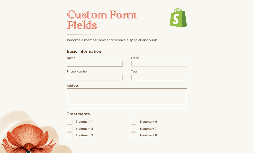
Creating a custom experience for your customers on Shopify may sometimes require a little extra personal touch than the default settings offer. Throughout this tutorial, we will be inserting custom form entries into the contact form of the Dawn Shopify theme. These will include text input fields, a dropdown selection, radio buttons, and a checkbox.
If you prefer video tutorials over text, feel free to skip this post and watch the video below. If not, please continue reading.
 Join Our Free Shopify Support Group
Prerequisites
- Basic understanding of HTML and Liquid (Shopify’s templating language).
- Access to your Shopify theme’s code.
Step 1: Open Your Theme Files
First, you have to access the theme code:
- Go to your Shopify admin panel.
- Click on ‘Online Store’ and then on ‘Themes’.
- Find your Dawn theme, then click on ‘Edit code’.
Step 2: Edit Contact Form
You will need to search the contact-form.liquid file in the ‘Sections’ directory, and on opening this file, it contains your contact form with its structure and layout details.
Step 3: Add Text and Dropdown Fields
To the form, we added three text input fields for Year, Make, and Model respectively. These are organized with a clean grid layout giving it a neat yucky look.
<div class="form-grid">
    <div class="field">
      <input
        type="text"
        id="ContactForm-year"
        class="field__input"
        name="contact[Year]"
        placeholder="Year"
      >
      <label class="field__label" for="ContactForm-year">Year</label>
    </div>
    <div class="field">
      <input
        type="text"
        id="ContactForm-make"
        class="field__input"
        name="contact[Make]"
        placeholder="Make"
      >
      <label class="field__label" for="ContactForm-make">Make</label>
    </div>
    <div class="field">
      <label for="ContactForm-model" class="field__label">Model</label>
      <select id="ContactForm-model" class="field__input" name="contact[Model]">
        <option value="">Select a model</option>
        <option value="Model 1">Model X</option>
        <option value="Model 2">Model Y</option>
        <option value="Model 3">Model Z</option>
      </select>
    </div>
</div>
The field class provides styling inherited from the Dawn theme, such as spacing and font styling.
Step 4: Adding Radio Buttons
For the customer type, we added two radio buttons labeled ‘New’ and ‘Returning’. The ‘New’ radio button is pre-selected using the checked attribute.
<div class="field choice-field">
    <span class="field__label-choice">Are you a new or returning customer?</span>
    <label for="ContactForm-new-customer" class="radio-label">
      <input
        type="radio"
        id="ContactForm-new-customer"
        name="contact[Customer Type]"
        value="New"
        class="radio-button"
        checked="checked"
      >
      New
    </label>
    <label for="ContactForm-returning-customer" class="radio-label">
      <input
        type="radio"
        id="ContactForm-returning-customer"
        name="contact[Customer Type]"
        value="Returning"
        class="radio-button"
      >
      Returning
    </label>
</div>
Step 5: Add a Checkbox
Lastly, we added an opt-in checkbox for users to subscribe them to a newsletter.
<div class="field choice-field">
    <label for="ContactForm-newsletter" class="checkbox-label">
      <input
        type="checkbox"
        id="ContactForm-newsletter"
        name="contact[Subscribe]"
        value="Yes"
        class="checkbox-input"
      >
      Subscribe to our newsletter
    </label>
</div>
Step 6: Style Your Form
Underneath the surface of the Dawn theme, most of the styling is done by CSS classes, but we have added a little bit of custom CSS for some specific tweaks – some padding for the dropdown and some color for the default option.
#ContactForm-model {
    padding: 0 1.5rem;
}
#ContactForm-model option:first-child {
    color: gray;
}
.choice-field:after {
    display: none;
}
@media screen and (min-width: 750px) {
    .form-grid {
        display: grid;
        grid-template-columns: repeat(3,1fr);
        grid-column-gap: 2rem;
    }
}
Conclusion
With the steps given above, you can customize your contact form with additional fields to beef up your site functionality and its user experience. Remember to preview your changes and test your form functionality before going live with the published form on your store.
This tutorial should leave you with a better understanding of how to tailor your Shopify contact forms in such a way that they suit your type of business. Good luck!
Have you tried this customization? How did it work for your store? Let us know in the comments below!
